The Chase, 07/28/2013, watercolor on Canson 140lb cold press, waterbrush, Michael Anderson
Tuesday, March 29, 2016
View from Forest Park, The Chase, St. Louis
The Chase, 07/28/2013, watercolor on Canson 140lb cold press, waterbrush, Michael Anderson
Monday, March 28, 2016
Humble Drawing Tools
By Mark Alan Anderson | Liberty, Missouri
Marcia’s recent post about new tools got me thinking. Like
many artists, I like experimenting with different drawing instruments and
papers. I firmly believe that artists should work with the best materials they
can afford – clearly, there’s a dramatic difference between the pigments in
student grade paint and professional level stuff. But too often my students
fool themselves into believing that expensive tools somehow equal “better”
artwork. I’m a frugal guy (translation: cheapskate.) I need to justify “upgrading”
those tools of mine that otherwise work just fine.
For instance, my lead holder. More expensive than a No. 2
Ticonderoga pencil (which I also keep ready to hand), but it’s lasted me
thirty-five years and I see no reason to believe it won’t continue to work just
fine at least that much longer. It’s a humble drawing tool.
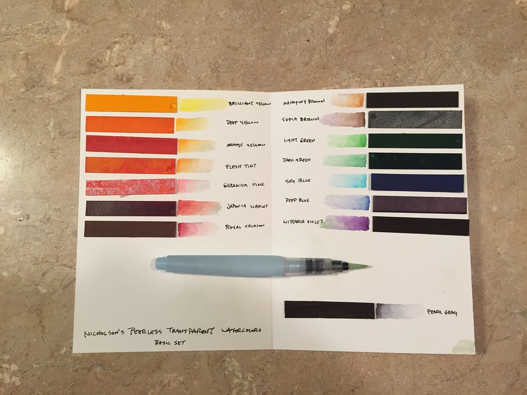
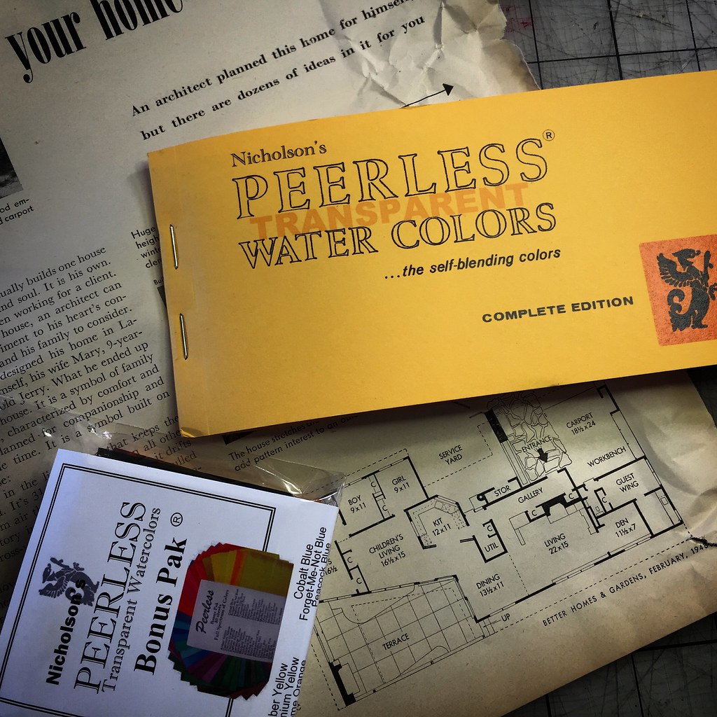
Recently I rediscovered an old favorite, Nicholson’s
Peerless Transparent Watercolors – definitely a humble artist tool, if there
every was one. Rather than in tubes or half pans, these fifteen intense
pigments are on individual sheets of card stock within a small pamphlet. While
there seems to be many approaches to creating a palette of these paints, I
simply snip off a half inch wide section and double stick it to a folded card.
The card fits neatly into my
sketchbook. The paint is activated with a dot of water, so brush pens are a
perfect companion. (And talk about compact: a couple pens fit into a breast
pocket and the sketchbook into my hip pocket.)

I’ve taped a piece of Yupo to the right hand side of the
card stock (not shown) so that the palette winds up being a tri-fold
configuration. The Yupo is an easily washed mixing surface.
And best of all, this incredibly simple kit has rich,
intense colors – it doesn’t take much!
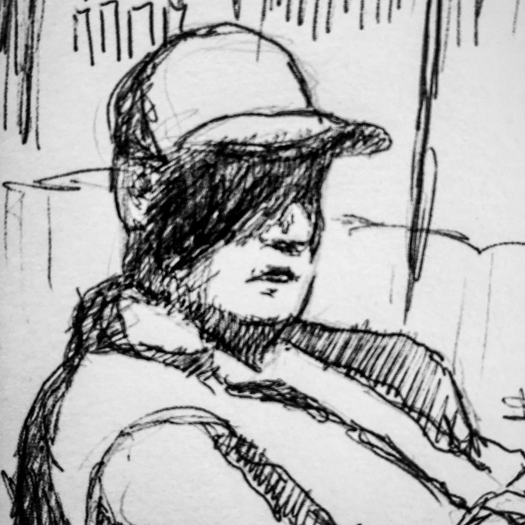
Last year one of my advanced drawing students began to
experiment with ball point pens. Really, just a plain old Bic pen with black
ink. I think they cost something like 59 cents...and the drawings were lovely, sensitive portraits! Plus, it turns out the ink is permanent.
With a little practice one can produce nice tonal variations, and the ink likes
to flow if one uses the medium point pen. I like Bic pens on nice, soft, white,
cottony papers. (Be advised that not all pens are alike. I’ve had poor results
with roller ball pens – and don’t get me started on “gel” pens! Bic seems to be
the best option.)
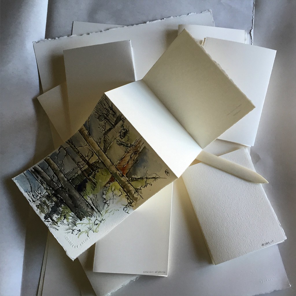
I also like making my own sketch books and sketch “booklets.”
I don’t really save money doing this, but I do wind up with the paper I prefer.
A couple of weeks ago I engaged in a little action research by testing out
various watercolor papers. I wanted a surface that would work well with my
Pentel Pocket Brush Pen, and would also produce good washes of color. My
watercolor paper of choice has been Arches Cold Press for many years, but it
doesn’t play nicely with the Pentel. So I made booklets up from various sheets
of Arches and Fabriano Hot Press.
I should explain that one sheet of 22 x 30 inch watercolor
paper costs between three and five bucks, and that I get four booklets of four
pages (eight if you use both sides of the sheet) from each sheet of watercolor
paper. My goal was to discover which paper best met my needs. (The winner, by
the way, turned out to Fabriano Artistico Hot Press, but I have yet to try the
Strathmore Aquarius II sheet that Marc Taro Holmes recommends for this same
purpose. So stay tuned!)
Sunday, March 27, 2016
Coffee shop sketches: trying out new tools
By Marcia Milner-Brage in Cedar Falls, Iowa
I purchased a set of Derwent Inktense pencils recently. I've never been too enamored with a set of Caran d'Ache watercolor pencils I inherited from my daughter who got them as a birthday present 12 years ago. So I took my new toys to Cup of Joe coffee shop here in Cedar Falls, Iowa, to give them a test-drive.
When I'm not traveling out of town, I'm a real homebody; I rarely go to coffee shops or restaurants. So even though on home turf, I was exploring new terrain.
Cup of Joe is on the corner of Main and First Street. Trying to establish more about the venue, I put in the afternoon traffic on First Street, as seen through the front window. Aha, another for my Inside/Outside Series!
I started with a line drawing using a calligraphy pen. Oops....the ink was water soluble...adding watercolor pencils maybe not the best combination. The guy on the right got kind of mucked up. I do like the irregular line the pen makes, though. I'll have to see about loading it with permanent ink cartridges. These two men seemed to be really enjoying each others company. Coffee shops are sure a great place to people watch!
| mannequin with white sunglasses |
I probably spent more time on this drawing than it was worth. Cup of Joe has a funky mid-century vibe. Mannequins with vintage clothes, formica tables, Fiestaware, and green and blue lampshades, which impart interesting colors onto people's faces.
The juries still out on my new Derwent pencils. I do like their vibrant color, reminiscent of my wax pastels that I have used a lot for years now. I think less is more (like the first sketch versus the last).
Any thoughts?
Saturday, March 26, 2016
Lunch time sketches, Downtown, St. Louis
Opportunities for urban sketching sometimes occur in fleeting moments. While eating lunch recently I had a few minutes to open my sketchbook and try to catch images of downtown. The views are as random as a winning lottery number. I read somewhere that the great artist John Singer Sargent could set up his easel virtually anywhere and create a masterpiece. That is a high standard to try to achieve but it is a good thing to remember so as not to get discouraged when subject matter and time are limited. Keep sketching!
Bespoke Sketchbook pages, 6"h x 6"w, Sharpie Flair pen, Faber-Castelli PITT artsist pens, shades of grey, 03/15-03/17, 2016. Michael Anderson
Wednesday, March 23, 2016
Urban Sketching as Historical Record...
 |
| I drew this little building on one of our sketchcrawls a few years ago, and I'm glad I did...it's gone now, and new houses are in its place. |
 |
| All that was left standing of the old laundry in our town that employed a great number of people. Now even that is gone. |
Sunday, March 20, 2016
Plein Aire Pastel
It's been quite a while since I've posted on UrbanSketchersMidwest. As many of you may have also experienced, I've been going through a bit of an artistic "identity conflict". I started working on my fine art in earnest about 3 1/2 years ago. Over that time I was focused primarily on technique...and getting my skills back up to an acceptable level. Much of that effort was spent painting on location.
About 4 months ago, I became somewhat disenchanted with the work I was doing. I felt it was a little too pedestrian. Focused on simply copying what was in front of me, and lacked the intensity and freedom I was looking to achieve. So...I started doing a bit of experimenting. I tried some abstracts, some tight, realistic approaches - and played with different mediums - acrylics, oils, lots of different watercolor techniques using plastic wrap, string, gauze, salt...you name it.
I also started spending more time composing paintings from photos and sketches I'd taken over the years. It's been a long, slow process - but I think I'm starting to come out of it with a few conclusions.
First, I've decided that I need to develop all areas, techniques and mediums that interest me. Second, that the real key in finding satisfaction in my work has been to spend considerable effort on simplifying my compositions and merging multiple shapes into simpler, larger, more interesting shapes. Within those shapes i have the freedom to work in a very loose manner. Third, I miss drawing, sketching, painting from nature.
This post is from an intentional trip out to paint plein aire. The above pastel was done on location just west of Kansas City in a county park not far from my house. I focused primarily on simplifying planes, and a very deliberate approach to the colors and contrasting warm and cool shapes. There are only four main shapes being 1) The sky 2) The background bank of trees along the horizon 3) The golden field of natural grasses and 4) The clump of trees in the center.
I included a photo of the actual scene so that you could compare the scene to the final work.
I was pretty pleased with the way this turned out. Unfortunately, my choice of fixatives was a poor one - and I pretty much ruined it. I used an archival varnish from Krylon that is made for use on multiple media including watercolor, acrylics, oils and "oil" pastels...I kind of assumed it would work for other types of pastels...oops. Oh well, the experience was well worth the effort - and I learned one more thing that I will put to use more often than not. So remember, if you are working in pastels or charcoal, only use a fixative that's made to work with those media.
Well, I hope you enjoy this post, and the work. Cheers and keep on sketching!
TK (a.k.a. David Tierney-Kanning)
Subscribe to:
Comments (Atom)


