
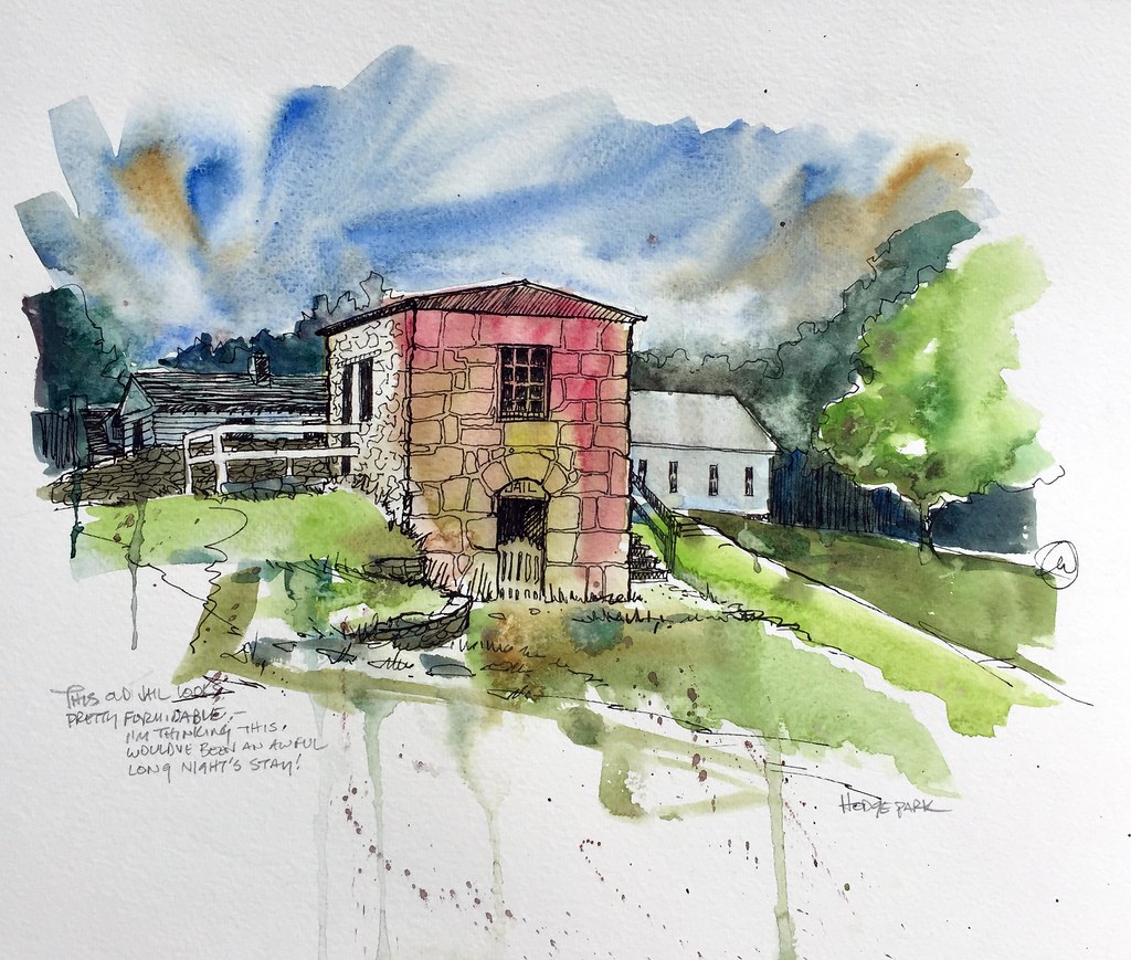
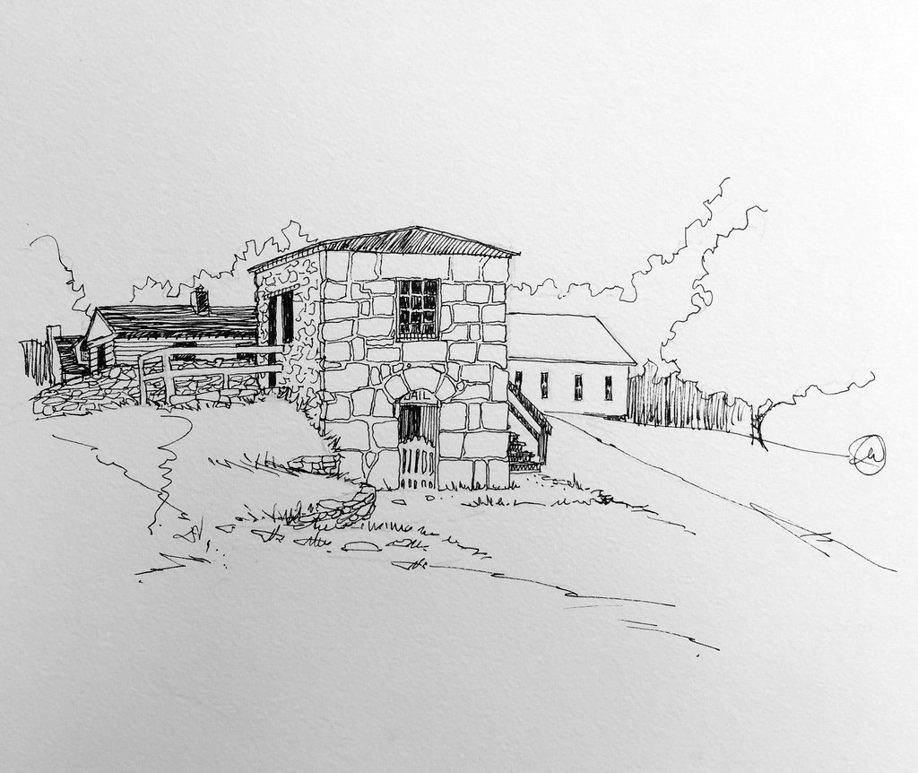
The buildings here have all been relocated from other places and brought together to provide a snapshot of what our area used to look like. As usual, I scribble with a pen first and then decide whether or not to add splashy washes of color. The jail depicted here looks to me to be one lonely and forlorn place to spend a night locked up!
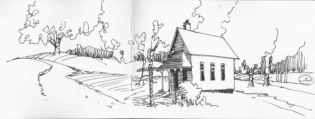
This is an old one room school house. One thing I try to do when I sketch locations is use elements of the locale to "lead the eye" around or through the composition. Thus, I'm always on the look out for diagonal lines, fences, tree lines, roads, etc. that conveniently allow this to take place.
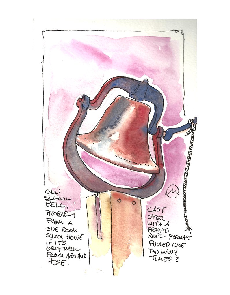
And just up the hill, atop a heavy wooden post, sits the old school bell. It's cast steel and looks like it would be very, very heavy. I enjoyed "keeping it simple" and just letting the colors run together to create the illusion of rust and patina.
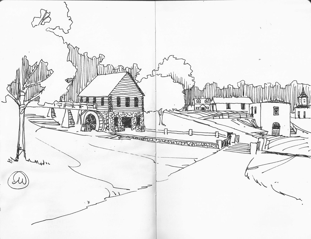
Here's another example of that principle. I enjoy finding a point-of-view that lets the road do the heavy lifting for me in the composition. I'm very interested in going back to draw that mill in the foreground, by the way.
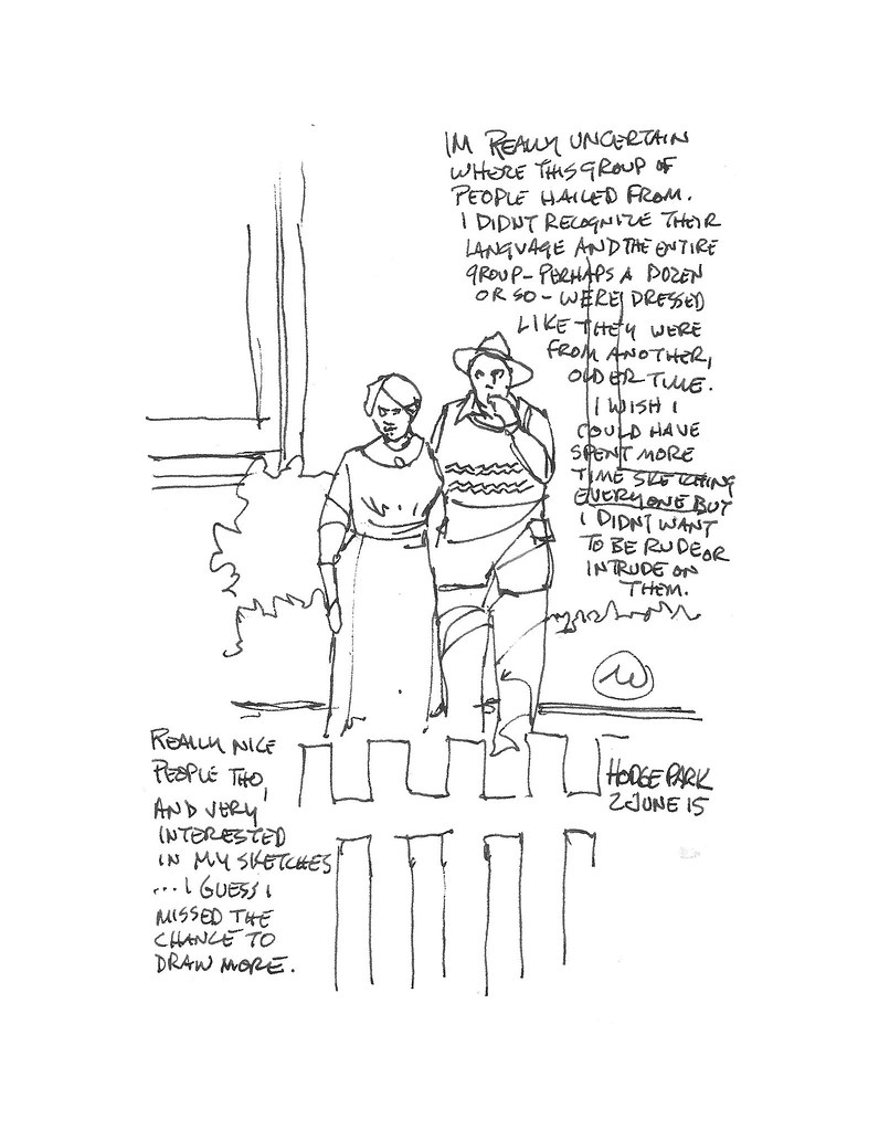
A group of visitors from outside the country were very interested in my sketches. Likewise, I was interested in them as well. I only managed to get one sketch made of their group, an older couple. The others were simply moving around too fast for me to even get a "grab sketch" made of them!

Here I was, just playing around. I needed a break from the pen and made this simple watercolor sketch. I think this is some sort of well house.
Shoal Creek has a lot of interesting vantage points from which to draw and paint. It's quite rich in architectural subject matter and is situated in a very pleasant green location. Best of all, it's free! I'll be heading back again because these sketches only scratch the surface.
These are gorgeous...that place is so much fun, we used to do reenactments there.
ReplyDelete(I added tags, by the way, so people can find it more easily in the future!)
ReplyDeleteThank you! I ALWAYS seem to forget to tag my posts.
DeleteTagging....a really good reminder Cathy!
DeleteMark: Wonderful group of sketches! Your lines are so confident, concise and loose. I like hearing your process of choosing your point of view and composition.
ReplyDeleteThank you, Marcia. I think one of the things I appreciate about the USk philosophy is that the process can be informative. Rather than simply posting images that scream out, "See how cleverly I can draw," the reportage aspect seems to add another layer. Whether it's a story of "place" and time, or - as in this case - communication of process, the narrative responds to an audience and often shapes our viewing in a way that might otherwise be marginalized as "Oooo! Pretty!" :)
DeleteNice sketches. Interesting to see the before (the sketch) and after (watercolor added).
ReplyDeleteThanks, Dave. To be entirely up front, I seldom put that level of line work detail into a sketch that I plan on adding washes of color to. It seems to me that the two complexities - i.e., hatching of lines and variety of textures in the wash - tend to be a bit incongruous at times, which I find can be distracting. So that sketch is a bit of an anomaly, in that I made the decision afterwards to add color.
DeleteYour line work is skillful & not overworked. It conveys your subject matter clearly and with concision with a nice energy. I like the watercolor of the well house. Interesting shapes and washes!
ReplyDeleteA lot of that can be attributed to those years of graphic design and layout, back before Photoshop and Illustrator, when comps were all done quickly with layout markers. The only way to make a buck, and still convince the client that they were looking at a representation of typography and photos was to work quickly and loosely so no one got hung up on whether or not the comp was representing the actual "look" of a final photo in the ad. It's funny to recall, in a way, that era of design between metal type and the computer. In a way, it made many of us from that generation into Rennaissance artists and designers - or at least proficient in more than one technique.
Delete